The anti-design movement emerged in the turbulent landscape of 1960s Italy, ignited by a wave of dissatisfaction towards the rigidity of modernist ideals and the cultural climate of consumerism.
Rather than shunning design entirely, pioneers such as Ettore Sottsass Jr. and radical collectives like Superstudio and Archizoom sought to redefine the boundaries of form and function, championing a philosophy rooted in critique, provocation, and expression.
Their work was characterised by distorted scales, brash colours, and ironic, deliberately kitsch features, upending the conventions of beauty in favour of social commentary and radical originality.
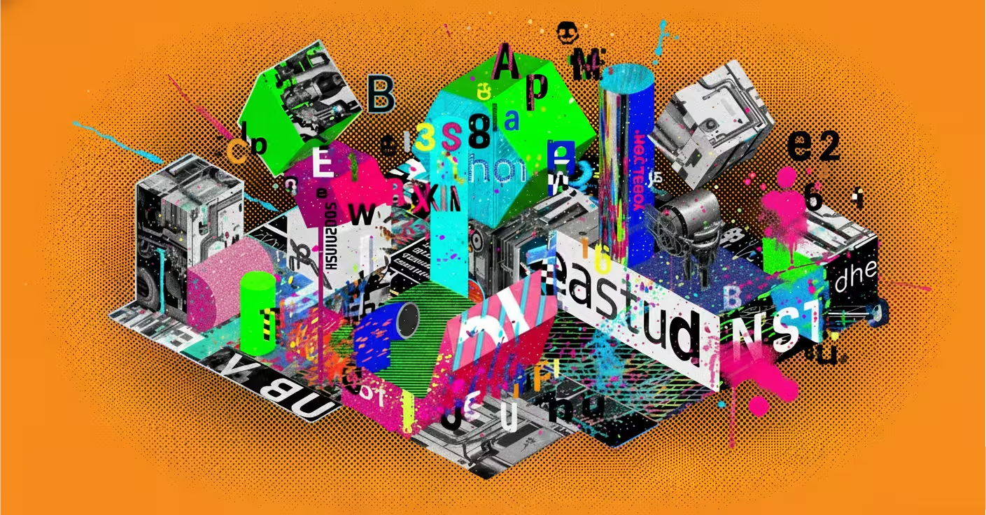
Contemporary designers are tearing up the rulebook, adopting unpredictable structures, raw visual elements, and clashing typography to signal authenticity, rebellion, and human imperfection.

Part 1: The Roots of Rebellion (1960s – 1970s)
Italian Radical Design: The Birth of “Anti-Design”
The term “anti-design” (controdesign) emerged not in a digital studio, but in the intellectual salons and workshops of post-war Italy. The movement was a direct reaction against the cold, impersonal, and universalist principles of Modernism and “Good Design,” epitomised by the International Style.
The Italian Radical Design movement, also known as anti-design or controdesign, originated in the creative hubs of Florence and Milan in the mid-1960s. This powerful cultural movement was a deliberate rejection of Modernism’s rigid, functionalist aesthetics and the commercial constraints of “Good Design.”
For a detailed look at how radical figures like Archizoom Associati and Superstudio used design as a form of social and political critique, the article Radical Design: Italian Anti-Design (1960–1975) provides insight into their provocative approach.
These groups embraced kitsch, irony, and conceptual works that opposed the industrial norm, creating art and design pieces that questioned consumer culture and challenged the status quo.

The movement produced iconic conceptual projects such as Archizoom’s “Dream Beds” (1967) and Superstudio’s “Il Monumento Continuo” (The Continuous Monument) (1969), which were not meant for mass production but acted as utopian and dystopian critiques of societal values.
For an in-depth exploration of Superstudio’s role and impact within Radical Design, see the Superstudio Wikipedia page, which details their experimental architecture and visionary critiques of urban planning.
These works elevated design from mere product creation to a powerful platform for cultural commentary, influencing the trajectory of postmodern design and sparking ongoing dialogues about the social role of art and architecture
- Key Groups: Collectives like Archizoom Associati, Superstudio, and Gruppo Strum were at the forefront.
- The Philosophy: They rejected the idea that design should solely serve industry and consumerism. Instead, they used design as a tool for social and political critique, creating objects that were ironic, kitsch, and often non-functional.
- Iconic Works: Projects like Archizoom’s “Dream Beds” (1967) and Superstudio’s “Il Monumento Continuo” (The Continuous Monument) (1969) were not meant for mass production. They were conceptual provocations—utopian (and dystopian) visions that questioned the very role of design in society.

Part 2: Postmodern Playfulness (1980s)
The Memphis Milano: Making Anti-Design Iconic
If the Radical Design movement was the theory, Memphis Milano was its explosive, colourful practice. Founded by Ettore Sottsass in 1981, Memphis became the global face of anti-design.
If the Radical Design movement laid the theoretical foundation, Memphis Milano was its vibrant, colourful explosion into practice. Founded by Ettore Sottsass in 1981, Memphis Milano became the global face of anti-design, shattering expectations with its bold use of clashing colours, plastic laminates adorned with abstract and kitschy patterns, and asymmetric geometric forms.
The following article details how this aesthetic revolution rejected the sober minimalism of the past in favour of design that was emotional and provocative: How Memphis Milano Shook The Design World.
The group was less concerned with ergonomic perfection and more focused on creating pieces that served as cultural commentary.
The cultural impact of Memphis was immediate and unforgettable, with furniture, lighting, and objects that shocked and delighted in equal measure. Their work embraced the ephemeral, designing for statement rather than timelessness.
For an in-depth look at Memphis’s striking style and its lasting legacy in design history, see the comprehensive Wikipedia entry on the Memphis Group.
Though their formal activity was brief—only about seven years—key figures such as Sottsass, Michele De Lucchi, and Nathalie du Pasquier became legends, influencing the shift toward more expressive, personal, and ironic approaches in design that resonate to this day.
- Aesthetic Revolution: Memphis rejected sober, functionalist design in favour of bold, clashing colours, plastic laminates with abstract and kitschy patterns, and asymmetric, geometric forms.
- Cultural Impact: Their furniture, lighting, and objects were shocking, frivolous, and unforgettable. They embraced the ephemeral, designing for emotion and statement rather than timelessness. Memphis wasn’t about creating a chair that was perfectly ergonomic; it was about creating a chair that was a piece of cultural commentary.
- Legacy: While short-lived as a formal group, Memphis shattered the design world’s conventions, opening the door for more expressive, personal, and ironic approaches. Key figures like Sottsass, Michele De Lucchi, and Nathalie du Pasquier became legends.

Part 3: Grunge and Digital Dissent (1990s)
David Carson and the Typography of Chaos
As the world went digital, the anti-design ethos found a new canvas: the printed page and the early web. The 1990s grunge and punk scenes provided the perfect cultural fuel.
David Carson redefined graphic design in the 1990s by infusing the anti-design ethos into the print and early digital worlds, with his landmark role as art director of Ray Gun magazine. This publication became a playground for his disruptive style, blending chaotic layouts and deconstructed typography that prioritised emotional impact over legibility.
Notably, Carson famously typeset an interview with Bryan Ferry entirely in the unreadable Zapf Dingbats font, exemplifying his belief that if content was dull, the design didn’t have to be understandable.
For an insightful overview into this radical approach and its influence on 1990s design culture, see the article Ray Gun, which explores how Carson’s work shifted graphic design toward expressive, intuitive communication.

Carson’s design philosophy, encapsulated in his book The End of Print, argued that readers engage not just with clarity but with feeling and instinct, challenging traditional rules that prioritise neatness and readability.
His typographic experimentation gave birth to what is often called “grunge typography,” which reflected the raw energy of the punk and alternative scenes of the time. For a detailed discussion on how Carson’s visionary work at Ray Gun continues to inspire designers and disrupt norms even today, check the article David Carson / Ray Gun Magazine.
Carson’s legacy remains significant as a pioneer who ushered an era where design could communicate through mood and chaos as much as through words.
- The Ray Gun Era: Graphic designer David Carson, through his work for Beach Culture and especially Ray Gun magazine, became the era’s most influential disruptor.
- The Method: Carson famously prioritised emotional impact and visual energy over legibility. He used distorted, deconstructed typography, chaotic collages, and fragmented layouts. His most legendary act was setting an interview with Bryan Ferry in the unreadable Dingbat font “Zapf Dingbats,” arguing that if the content was boring, the design shouldn’t have to be.
- The Philosophy: His approach, encapsulated in his book The End of Print, argued that readers are intelligent and can be engaged through feeling and intuition, not just passive clarity.

Part 4: The Digital Revival (2010s – Present)
Brutalism and the Web’s Awkward Phase
The 2010s saw a new wave of digital anti-design, often labelled as “Brutalist Web Design.“ This was a reaction to the smooth, template-driven aesthetics of Web 2.0 and the rise of generic website builders.
The 2010s ushered in a new wave of digital anti-design known as Brutalist Web Design, a stark reaction against the polished, template-driven aesthetics of Web 2.0 and the rise of generic website builders. Characterised by raw HTML, default system fonts, plain backgrounds, and a hyper-skeletal, almost confrontational lack of styling, this movement embraced simplicity and honesty.
The following article offers a deep dive into Brutalist Web Design’s key features, highlighting how it challenges traditional notions of organisation and beauty with asymmetry, clashing colours, and minimal CSS: A deep dive into brutalism.
This style reflects a punk-rock refusal to mask imperfections, favouring function and performance over decorative embellishments.
If you want to view many of the latest anti-design projects, visit the anti-design instagram page.
Brutalist sites often appear unpolished, using bold typography and unconventional layouts that reject user-friendly navigation in favour of raw, unfiltered expression.
As this article explains, Brutalism in web design plays with extremes—either minimalism or chaotic typography—while using high contrast or monochrome palettes reminiscent of concrete textures in Brutalist architecture: The Impact of Brutalism in Modern Web Design.
The movement stands as a statement against the bloated, tracker-infested, and overly commercialised web, embracing digital honesty and the beauty found in imperfection and rawness, thus redefining visual communication in the online world.
- Characteristics: Raw HTML, default system fonts, stark layouts, plain backgrounds, and a hyper-skeletal, almost confrontational lack of styling.
- The Why: It was a statement against the bloated, tracker-infested, and commercially polished corporate web. It stood for performance, honesty, and a punk-rock refusal to decorate.

The Modern Anti-Design Movement (2025 and Beyond)
Today’s anti-design is a synthesis of its entire history, supercharged by contemporary culture.
Today’s anti-design movement is a vibrant fusion of decades-long rebellion against conventional aesthetics, now amplified by the nuances of contemporary culture. It actively pushes back against the sameness imposed by website builders like Squarespace and Wix, as well as the ubiquitous “Corporate Memphis” illustration style that characterised much of the late 2010s digital landscape.
For a comprehensive analysis of how anti-design today stands as a countercultural force rejecting uniformity and digital polish, see this insightful article on what anti-design looks like in 2025.
This movement taps into a craving for authenticity, especially among Gen Z and Millennials, who resonate with the raw, imperfect aesthetics as a response to the artificiality of AI-generated content and meticulously curated social media personas.
Major brands have embraced anti-design strategically, harnessing its disruptive power for memorable campaigns that challenge traditional norms.
Charli XCX’s “Brat” campaign, for instance, leverages a confrontational acid-green palette and intentionally cheap fonts to evoke a raw subcultural identity, as detailed in industry discussions like Charli XCX’s bold visual style.
Likewise, Kiehl’s provocative “Pubic Display Type” font champions body positivity through deliberate awkwardness, while fashion brands like Vetements and Balenciaga use lo-fi styling and awkward posing to question and disrupt mainstream fashion narratives.

Next Wave: Five Anti-Design Visionaries Shaping 2026
Here are five up-and-coming anti-design artists to watch out for in 2026, emerging amid the movement’s resurgence and evolving cultural relevance:
Niche Anti-Design Influencers on Social Platforms
Several rising creators on Instagram and TikTok are gaining attention by mixing traditional anti-design chaos with modern digital culture and social commentary, infusing maximalist layering, distorted portraits, and rebellious typography that resonate strongly with Gen Z and Millennials.
Platforms like Instagram and TikTok have become hotbeds for these niche anti-design influencers who challenge conventional aesthetics while engaging audiences with bold, chaotic visuals.
This fusion of analog disruption and digital savvy marks the cutting edge of contemporary creative expression, reflecting a cultural craving for authenticity and defiance in the face of polished perfection, as detailed in this insightful overview of the anti-design trend in 2025.
Their work demonstrates how anti-design thrives in the social media landscape, leveraging fast-paced platforms to amplify its disruptive and memorable style.
Lindsay Marsh
Lindsay Marsh is an emerging force in the anti-design movement, known for her raw, rebellious graphic work that blends punk-grunge aesthetics with a celebration of human imperfection.
Her designs boldly break away from polished digital norms, perfectly embodying the spirit of anti-design’s resistance to AI-generated blandness and conformity.
You can explore her vibrant portfolios and courses through her official portfolio and learn from her extensive teaching work on platforms like Skillshare and Udemy.
Lindsay also shares insights and creative advice on her Substack newsletter, offering a deeper dive into her approach and design philosophy. Her growing influence is capturing attention for bringing a disruptive, authentic voice to contemporary design.

BASE Milano’s Rising Collective
BASE Milano’s Rising Collective is at the forefront of pushing anti-design into radical, socially engaged territories through their landmark initiative, We Will Design 2026. This project invites designers and creatives to explore darkness not as emptiness but as a fertile space for resistance, imagination, and regeneration.
The collective embraces complexity and marginalised voices, turning shadows into infrastructures that support new ways of living and coexisting.
Their work is grounded in social and political critique, influenced by contemporary thought such as Black feminist theory and works like Undrowned by Alexis Pauline Gumbs.
Every year during Milan Design Week, BASE transforms into a dynamic lab where emerging voices and visionary prototypes challenge conventions and push design’s social role into bold new directions.
This initiative is a powerful example of how anti-design transcends aesthetics to become a transformative cultural practice that embraces ambiguity and radical alternatives.
Hiller Goodspeed
Hiller Goodspeed is a visual artist celebrated for blending warmth with visual chaos through bold colours and textured forms, creating a uniquely human and emotive layer within graphic disruption.
Based in Vancouver, his work is characterised by its deceptively simple, childlike drawings filled with profound, humorous, and often uplifting messages that invite viewers to rethink conventional aesthetics.
His pencil and coloured graphite illustrations strike a balance between naivety and depth, creating characters and phrases that resonate emotionally while maintaining an approachable charm.
Hiller’s art has gained recognition through collaborations with brands like Urban Outfitters and Google, and he shares insights about his creative process on platforms like It’s Nice That and Odd Pears.
His commitment to authenticity and approachable simplicity embodies the anti-design ethos by disrupting polished, sterile visuals with genuine emotional connection.

Young Designers Embracing Punk & Grunge Revival
Emerging talents revisiting punk-grunge and DIY zine aesthetics are pushing the limits of typography and layout with intentionally messy, chaotic, and confrontational work. Figures inspired by David Carson’s legacy are shaping this new wave.
Top Anti-Design Campaigns in the Wild
The punk and grunge revival in 2025 and beyond is being led by a fresh cohort of young designers who are pushing the boundaries of typography, layout, and visual expression with deliberately chaotic, messy, and confrontational aesthetics.
This resurgence taps into punk’s original ethos of rebellion and DIY ethics, but with a contemporary digital twist that resonates deeply with Gen Z and Millennials. The movement celebrates imperfection and rawness as an antidote to hyper-curated online culture, reflecting a desire for authenticity and emotional expression.
According to the feature “The New Grunge Renaissance: Why 2025 Feels Like 1995 Again” by 23 Magazine, the grunge revival goes beyond nostalgic fashion trends to embody an anti-establishment cultural statement embraced by underground streetwear collectives and young designers creating hand-distressed one-off pieces.
| Campaign / Brand | Key Anti-Design Traits | The Strategic “Why” |
|---|---|---|
| Charli XCX’s “Brat” Campaign | An “ugly” acid-green colour, “cheap”-looking fonts, and a raw, unpolished visual tone. | To create a distinct, subcultural identity that rejects mainstream pop aesthetics and feels authentically gritty. |
| Kiehl’s “Pubic Display Type” | A font created from pubic hair imagery; deliberately provocative and unconventional. | To champion body positivity and generate earned media through bold, conversation-starting design. |
| Cheetos “Other Hand” Font | A child-like, messy, and imperfect typeface designed to be “unskilled.” | To reinforce brand playfulness and stand out from the clean, corporate aesthetics of other snack brands. |
| Fashion Brands (Vetements, Balenciaga) | Awkward poses, garish fonts, and “lo-fi” styling in campaigns and visuals. | To challenge fashion industry norms, critique consumerism, and cultivate an avant-garde, dissident image. |
| Brutalist Websites | Raw HTML, default system fonts, stark layouts, and a “bare-bones” aesthetic. | To reject the bloat of modern web design, prioritize fast loading, and convey a sense of straightforward, no-nonsense honesty. |

A Strategic Guide: When to Use (and Avoid) Anti-Design
Adopting an anti-design philosophy is a high-risk, high-reward strategy. It is not suitable for every project.
Adopting anti-design as a strategic approach can deliver significant rewards but also carries risks, particularly due to its unconventional aesthetics and potential challenges to usability. Anti-design is best embraced within creative industries such as art, music, fashion, and entertainment, where bold visual statements are valued.
It’s also highly effective in youth-focused marketing campaigns targeting Gen Z and Millennials, who appreciate authenticity and rebellion, as well as editorial or commentary projects aiming to provoke thought.
For a strategic overview of how anti-design breaks digital conventions and connects with culturally aware audiences, the article What Is Anti-Design? The Trend That Tears Up the Rule Book in 2025 offers valuable insight.
However, anti-design should be avoided in functional and critical services such as banking, healthcare, government, or ecommerce where clarity, usability, and accessibility are paramount.
Similarly, traditional or authority-seeking brands like law firms or financial institutions must maintain conventions that build trust through stability and professionalism. The risk lies in alienating users who expect straightforward navigation and readability.
Marketers and designers should consider anti-design for specific campaigns where high impact and disruption are intentional rather than for ongoing branding.
For detailed best practices and considerations, see Embracing Anti-Design: How to Do It Well, which highlights how to balance creativity with user experience effectively.
Embrace Anti-Design For:
- Creative Industries: Brands in art, music, fashion, and entertainment.
- Youth-Focused Marketing: Campaigns targeting demographics that value authenticity and rebellion.
- Editorial & Commentary: Projects aiming to make a bold statement or provoke thought.
- Specific Campaigns: To launch a disruptive product or create a short-term, high-impact marketing splash.
Avoid Anti-Design For:
- Functional & Critical Services: Banking, healthcare, government, or e-commerce sites where clarity is paramount.
- Accessibility-Critical Audiences: When your design could create barriers for users with disabilities.
- Traditional or Authority-Seeking Brands: Law firms, financial institutions, or any brand where trust is built on stability and convention.

The Elephant in the Room: Anti-Design and Accessibility
This is the movement’s most significant challenge. Disorienting layouts, poor colour contrast, and chaotic typography can create insurmountable barriers for people with visual, cognitive, or motor impairments.
Disorienting layouts, poor colour contrast, and fragmented typography can exclude many users if not handled carefully. However, ethical anti-design practitioners prioritise intentionality and mitigation strategies to create memorable, unconventional experiences without alienating audiences.
For example, ensuring keyboard navigation and adhering to contrast ratio standards can make clashing colours and bold styles accessible. The article Design Without Barriers: The Evolution of Accessibility in 2025 explores how accessibility has become foundational in effective visual communication, not just a checklist item, emphasising inclusive design benefits everyone.

New regulations like the European Accessibility Act (EAA) highlight the growing importance of embedding accessibility from the start, not as an afterthought.
Designers are encouraged to blend creativity with usability by offering alternatives like adjustable text size, clear focus indicators, and thoughtful information architecture to accommodate cognitive limitations, as detailed in 2025 Accessibility Regulations for Designers.
The goal is to disrupt visually without creating barriers, ensuring that anti-design remains innovative yet inclusive.
Incorporating compassionate design principles leads to more engaging and equitable experiences for all users, proving that accessibility and creativity can coexist harmoniously.

The Enduring Conflict: Anti-Design’s Legacy and Challenges
The history of anti-design is indeed a story of conflict and rebellion, serving as a vital counterweight to design’s often rigid dogma.
Originating in the 1960s Italian Radical Design movement, anti-design challenged the minimalist, functionalist norms of modernism by using irony, chaos, and cultural critique to provoke thought and disrupt consumerist values.
For a detailed exploration of this foundational period and how these designers used their work as political and social commentary, see the article on Anti-design – Design after Capitalism. This philosophy continues today as a provocative force that demands designers rethink the rules and embrace the imperfect, emotional, and human aspects of creative expression.
Ultimately, the anti-design movement proves that design is not a set of immutable laws but a living, breathing dialogue. It reminds us that beyond functionality and simplicity, design has the power to challenge, disrupt, and forever change how we see the world.