Those elegant, frosted-glass panels drifting across modern interfaces are part of a wider movement towards glassmorphism in UI design, where semi-transparent layers, soft blur, and subtle shadows create the illusion of digital glass while still keeping content legible and focused.
In 2026 this look has become a defining part of contemporary web design trends, supported by modern GPUs and browsers that can smoothly render blur and translucency across dashboards, mobile apps, and complex product interfaces without sacrificing performance.
Momentum has grown even further since Apple introduced its Liquid Glass design system, a unified visual language where interface elements behave like responsive glass, refracting and reflecting surrounding content to create depth across iOS, iPadOS, macOS and beyond.
As designers borrow cues from 2026 UI design trends and combine glassmorphism with bold type, dark-mode gradients and spatial UI, accessibility has become a key talking point, with guidance on keeping contrast compliant and motion controlled so that this aesthetic remains inclusive as well as beautiful.
What Is Glassmorphism?
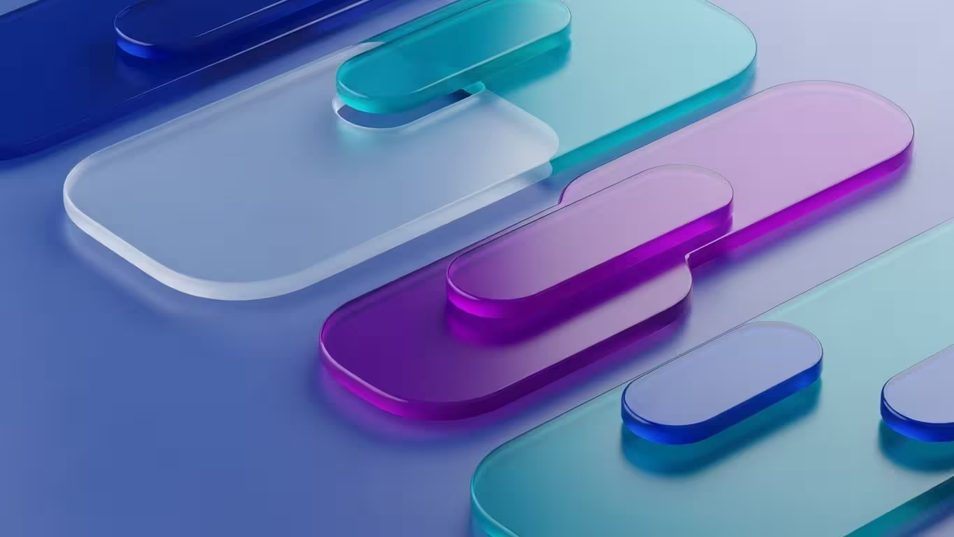
Glassmorphism is a visual design style that mimics the appearance of frosted glass, combining transparency and background blur with soft layering to create depth and hierarchy in digital interfaces.
This approach gives users the sense that they are looking through stacked panes of semi-transparent glass, where background colours subtly diffuse through foreground elements while key content remains clear and readable, an effect now widely documented in contemporary UI design guides and practical tutorials for tools like Figma.

The term “glassmorphism” was coined by designer Michał Malewicz in 2020, building on a lineage that stretches back to Apple’s translucent Aqua interface in early Mac OS X and the more recent “vibrancy” materials seen in macOS Big Sur.
Unlike flat design, which strips away depth, or neumorphism, which uses soft shadows on solid surfaces, glassmorphism introduces controlled translucency and light to separate elements without harsh borders, while modern accessibility research stresses pairing these effects with WCAG contrast guidelines and inclusive patterns so interfaces remain as usable as they are visually striking.
Why Glassmorphism Matters in 2026
Several factors have converged to make glassmorphism particularly relevant this year.
Technology Has Finally Caught Up
Technology has finally caught up with the aesthetic ambition of glassmorphism, which for years lived mostly in polished Dribbble shots and concept explorations rather than real products.
Today, powerful GPUs in even mid-range devices can handle background blur and layered transparency with ease, so those once “heavy” visual effects now run smoothly in live dashboards, native apps, and complex web experiences without the stutter or battery drain designers used to fear.

At the same time, modern CSS features have made glassmorphism dramatically easier to implement on the web, with properties such as backdrop-filter gaining broad support across major browsers and enabling reliable, performant blur directly in production code.
Combined with GPU-accelerated compositing and smarter browser rendering pipelines, this means designers can confidently use translucent panels, subtle glows, and stacked layers of “digital glass” as functional interface elements rather than just aspirational visuals.
Apple’s Liquid Glass Has Raised the Bar
Apple’s Liquid Glass interface has pushed glassmorphism from stylistic experiment to a serious, system-level design language embedded across iOS 26, macOS Tahoe, and the wider Apple ecosystem.
By going beyond simple blur and opacity, Liquid Glass simulates realistic lensing and refraction effects that react to light, motion, and interaction, making UI elements feel like responsive, physical materials rather than flat overlays.

Because these glass-like effects are now part of a major operating system’s native components rather than just concept art, many designers see this as strong validation that glassmorphism in user interfaces is a durable visual language, not a passing fad.
That platform-level endorsement reassures teams that investing in translucent layers, depth, and motion is aligned with modern OS conventions and can sit comfortably alongside broader UI design trends without feeling
Flat Design Fatigue
Flat, ultra-minimal interfaces have dominated so many apps and websites that design teams are increasingly talking about flat design fatigue, where products start to look sterile, generic, and a little too clinical.
By contrast, glassmorphism in UI design offers a softer, more layered look that still feels clean but adds atmosphere through blur, translucency, and depth, echoing the more tactile system materials seen in platforms like Apple’s Liquid Glass.

That frosted-glass aesthetic helps interfaces feel less mechanical and more approachable, letting background colour and imagery subtly glow through while cards, panels, and buttons remain clearly separated and readable, especially when paired with modern visual hierarchy best practices and solid accessibility contrast guidelines.
For many designers and users, this balance between clarity and character makes glassmorphism a refreshing alternative to purely flat blocks of colour, bringing some of the warmth and dimensionality of earlier skeuomorphic eras into a contemporary, production-ready aesthetic.
Glassmorphism adds quality to your design
Glassmorphism’s polished, frosted-glass surfaces and precise blur immediately suggest advanced technology and craftsmanship, so users often read it as a sign of a premium digital product.
When executed well, the layered transparency, glow, and depth feel closer to high-end industrial or automotive design than to basic flat UI, which helps interfaces communicate reliability, innovation, and care.

This is why glass-like effects are so common in sectors where perception and trust are critical, such as fintech dashboards, trading platforms, and portfolio tools, as well as luxury, lifestyle, and high-end tech brands.
In those contexts, glassmorphism does more than decorate: it reinforces a sense of sophistication and attention to detail that aligns with what users expect from “top shelf” services and products.
Core Principles of Glassmorphism Design
Before applying glassmorphism to your projects, understanding its foundational elements helps ensure you achieve the desired effect whilst maintaining usability.
The Frosted Glass Effect
Glassmorphism’s signature frosted glass effect is created by layering semi-transparent panels over a blurred background so that shapes and colours beneath remain softly visible rather than fully hidden, keeping the interface connected and dimensional.
Designers typically rely on GPU-accelerated CSS backdrop filters or native “vibrancy” materials to achieve this, which works especially well for navigation bars, cards, and overlays that need to stand out without feeling heavy or visually noisy.

When the background blur is kept to a moderate strength, it gently separates foreground content from the underlying layout, helping users focus on key information while still sensing the page structure—an approach echoed in modern macOS and iOS interface guidelines that emphasise depth and context.
Paired with fine borders, subtle highlights, and carefully managed contrast in line with WCAG accessibility rules, this glass-like translucency delivers a calm, contemporary, and sophisticated aesthetic that fits naturally into premium dashboards, operating systems, and brand experiences.
Multi-Layered Depth
By overlapping transparent layers, designers can simulate physical space within a two-dimensional layout. Glassmorphic elements can appear to float above or sink behind others depending on how light and shadow are applied. The balance between sharp edges and diffused transparency evokes both structure and fluidity simultaneously.
Strong Backgrounds and Contrast
Strong, well-chosen backgrounds in UI design are crucial to making glassmorphism really shine, because vibrant colour, soft gradients, or even gently animated scenes provide the visual energy that frosted panels diffuse and refract.
When the backdrop has enough variation in hue and lightness, translucent surfaces feel more dimensional and alive, giving the interface a sense of depth that flat, monochrome backgrounds struggle to achieve, especially when combined with modern CSS blur and translucency techniques.

At the same time, maintaining sufficient colour contrast for accessibility between the background, the glass panel, and the text on top is essential so users can quickly distinguish interactive elements and read content comfortably.
Accessibility guidance rooted in standards like WCAG encourages designers to test how blur and translucency affect legibility, ensuring that even with rich, colourful backdrops, frosted cards and their typography remain clear for users with low vision or on lower-quality displays, which is increasingly highlighted in discussions of inclusive glassmorphism.
Controlled Opacity and Blur
The real craft of glassmorphism comes down to fine-tuning opacity and blur values so they strike the perfect balance between depth and readability. Set the transparency too high, and the background overwhelms the foreground content; dial it too low, and the layered glass effect flattens out into something closer to basic overlay.
Most designers settle on opacity between 10% and 40%, tweaking based on the backdrop’s brightness and vibrancy to keep elements distinct yet connected.

Blur radius plays an equally vital role, typically landing around 10-20px for that signature frosted look without sacrificing sharpness on text or icons.
Pairing these with subtle borders or highlights ensures the panels pop against dynamic gradients or images, while always previewing on different devices to confirm the effect holds up under real-world lighting and screen conditions.
Refined Borders, Shadows, and Gradients
Refined borders are essential in glassmorphism, providing crisp separation for translucent layers so they don’t melt into the background, while soft inner or outer shadows add believable dimension without overwhelming the subtlety.
Gradients bring warmth and gentle motion, often shifting hues dynamically to mimic how real glass catches and refracts light, especially when layered over vibrant backdrops in modern UI design toolkits.

These details keep interfaces from feeling cold or sterile, turning flat digital surfaces into something tactile and alive—many designers now pair glass panels with subtle gradient backgrounds that evolve with user scroll or hover, enhancing the illusion of material interaction while adhering to accessible shadow and border practices for clear hierarchy across devices.
Implementing Glassmorphism with CSS
Creating glassmorphism effects with CSS has become remarkably straightforward. The following properties form the foundation:
.glass {
  background: rgba(255, 255, 255, 0.1);
  backdrop-filter: blur(10px);
  -webkit-backdrop-filter: blur(10px);
  border-radius: 10px;
  border: 1px solid rgba(255, 255, 255, 0.2);
  box-shadow: 0 8px 32px 0 rgba(31, 38, 135, 0.37);
}Understanding Each Property
The backdrop-filter: blur() property handles the core magic in glassmorphism, softly blurring everything behind an element to produce that authentic frosted-glass look, while the -webkit- prefix ensures smooth compatibility across Safari and older browsers.
Pairing this with rgba() values at low opacity—usually 0.1 to 0.3—lets the diffused background shine through without compromising text legibility, complemented by a thin border for edge definition and a light box-shadow to suggest realistic depth.

For more advanced touches like gradient borders on rounded corners over blurred backdrops, contemporary CSS leverages mask and mask-composite properties, delivering cleaner results than legacy approaches such as border-image or background-clip.
These techniques maintain transparency and performance even on complex layouts, aligning with modern browser standards and enabling fluid, production-ready glass effects across devices.
Glassmorphism in Design Systems
For design teams, glassmorphism functions as more than a visual flourish—it becomes a systematised design language. When incorporated into a design system, its rules define how transparency, colour, shadows, and blur are consistently applied across products.
Design systems with glassmorphic principles typically define opacity levels for translucent panels, blur radius settings, contrast ratios for readable text, and shadow and border thickness.

These parameters bring structure to what could otherwise feel like a purely aesthetic trend, ensuring visual harmony as interfaces scale across platforms.
Integrating glassmorphism into component libraries enables designers to reuse and modify elements that adhere to unified transparency and blur properties.
This modularity makes it straightforward to extend the aesthetic across buttons, input fields, menus, and overlays whilst maintaining consistency.
Where Glassmorphism Works Best
Glassmorphism shines in specific contexts and applications where its qualities enhance rather than hinder the user experience.
| Application Type | Why It Works |
|---|---|
| Weather applications | Frosted panels over atmospheric backgrounds create intuitive depth |
| Music players and streaming | Glass effects add sophistication to album artwork displays |
| Finance dashboards | Translucent overlays help organise complex data elegantly |
| Calendar widgets | Blurred backgrounds improve event readability |
| Login forms | Semi-transparent fields convey professionalism |
| Cryptocurrency platforms | Glass aesthetics suggest premium, high-tech experiences |
| Productivity tools | Layered transparency creates calm, focused interfaces |
Challenges and Accessibility Concerns
Despite its undeniable visual charm, glassmorphism brings challenges like performance bottlenecks on lower-end hardware, where intensive blur and compositing layers can stutter animations or drain batteries faster than simpler designs.
Readability issues also arise when translucent panels obscure text or controls, particularly under varying screen brightness or for users with low vision, demanding rigorous contrast testing against WCAG standards.

Browser inconsistencies further complicate rollout, as backdrop-filter support lags in some engines, forcing fallbacks that dilute the effect, while motion-heavy refractions risk triggering vestibular discomfort for sensitive users without prefers-reduced-motion queries.
Savvy teams counter these by auditing early, layering solid variants, and prioritising inclusive patterns that let the aesthetic thrive without alienating anyone.
Contrast and Readability Issues
Low contrast issues in glassmorphism pose the biggest risk, as white or light text on a wavy, translucent panel can blend into the blurred background, effectively vanishing for users with low vision or colour blindness.
This makes faint letters hard to parse, turning what should be a quick scan into a tiring, frustrating effort that undermines the entire user experience, especially on smaller screens or in bright lighting.

Designers counter this by enforcing strict WCAG AA or AAA contrast ratios between text, panels, and backdrops, often testing with tools that simulate visual impairments and opting for bolder typography or solid fallback states.
Pairing glass effects with high-contrast outlines or dynamic adjustments based on prefers-contrast media queries ensures readability holds up, keeping the aesthetic inclusive without sacrificing its elegant depth.
Performance Considerations
Strong blur effects in glassmorphism place heavy demands on the GPU, particularly on older smartphones or low-powered tablets where compositing multiple translucent layers can cause noticeable lag, dropped frames, or even app crashes during heavy interactions.
Without careful optimisation—like limiting blur radius, reducing layer count, or using hardware-accelerated rendering—these effects turn fluid animations into stuttery experiences that frustrate users on mid-range hardware.

Platforms vary widely in handling such visuals: macOS and modern iOS are finely tuned for vibrancy materials and real-time blur thanks to Metal API integration, while Android or Windows devices might rely on less efficient paths, amplifying the performance gap.
Designers mitigate this by profiling across devices, employing CSS will-change hints, and providing simplified fallbacks via media queries for reduced-motion or low-power modes to ensure smooth operation everywhere.
Visual Clutter
Too many stacked glass effects can overwhelm an interface, turning what should be a clean, layered design into a hazy mess where buttons, cards, and banners start blending into one another.
Heavy blur combined with competing shadows and outlines muddies visual hierarchy, making it harder for users to quickly spot interactive elements or scan content rather than guiding their eye intuitively.

Designers avoid this by applying glassmorphism sparingly—perhaps just to key overlays or sidebars—while keeping primary actions solid and high-contrast to anchor the layout.
Sparing use of blur intensity, unified shadow directions, and ample whitespace ensures the aesthetic enhances navigation without creating a distracting fog that slows users down.
Dark Mode Complications
Dark mode tends to expose glassmorphism’s weaknesses, as translucent layers can fade into inky backgrounds or pick up unwanted glows from blurred dark content, making panels nearly invisible.
What looks crisp and ethereal in light themes often turns murky or illegible here, with text struggling against low-contrast diffusion that accessibility tools flag immediately.

Designers tackle this by boosting panel opacity slightly for dark variants, adding darker borders or stronger inner shadows, and enforcing theme-specific contrast ratios via WCAG that account for reduced lightness.
Testing both modes side-by-side with real user simulations ensures the frosted elegance holds up without forcing users to toggle themes just to read comfortably.
Best Practices for Accessible Glassmorphism
Several straightforward habits help sidestep most accessibility pitfalls in glassmorphism, starting with enforcing WCAG-compliant contrast ratios so text always pops clearly against blurred or translucent backgrounds, no matter the lighting or user needs.
Keep critical content away from heavy blur or chaotic imagery by reserving strong glass effects for secondary elements like sidebars or modals, while primary buttons and headings stay solid and high-contrast.

Ample whitespace naturally separates layered panels, and rigorous testing across budget phones, flagships, light/dark modes, and tools like screen readers confirms the design remains intuitive and inclusive for everyone.
Designers who follow these—previewing with prefers-reduced-motion and prefers-contrast queries—deliver glassmorphism that delights visually without alienating users, turning a trendy aesthetic into a robust, equitable standard.
When to Avoid Glassmorphism
Glassmorphism shines in many scenarios but isn’t right for every project, so knowing when to skip it prevents performance headaches and usability issues down the line.
On older or low-end devices, its GPU-heavy blur and compositing can lead to frustrating lag or dropped frames, making simpler flat or material designs a smarter, faster choice for broad compatibility.
Applications needing razor-sharp clarity—like interactive maps, medical dashboards, or emergency interfaces—demand uncompromised contrast and detail that translucent layers and diffusion can muddy, risking critical misreads.

In these high-stakes contexts, prioritising solid elements, bold typography, and maximal legibility over aesthetic flair ensures reliability without the trade-offs glassmorphism introduces.
Content-heavy applications also struggle with extensive transparency. When screens feel crowded, blur effects make content harder to parse rather than easier.
Similarly, if your brand identity leans industrial, technical, or retro, the soft, glossy glassmorphism aesthetic may clash with your established visual language.
In these situations, simpler flat designs or alternative approaches typically serve users better.
Key Glassmorphism Design Tools and Resources
Several tools make it easier to bring glassmorphism from concept into real products, without endlessly tweaking settings by hand. The original Glassmorphism CSS Generator by Hype4 Academy lets you interactively adjust blur, opacity, colour, borders, and shadows, then copy clean CSS tailored for modern browsers.
For teams working in Figma, the platform’s native effects and community files such as the unofficial Glassmorphism UI kits provide ready-made components and styles you can drop straight into design systems, keeping iOS 26 and Liquid Glass–inspired layouts consistent.

On the implementation side, online tools like CSS Glass and UI Glass Generator output production-ready code using backdrop-filter, rgba overlays, and subtle shadows, making it simple to experiment with multiple variants before committing.
For inspiration, platforms like Dribbble and Behance showcase glassmorphic dashboards, apps, and websites in real contexts, while tutorials such as this focused glassmorphism best-practices video help refine technique, from accessibility-aware contrast choices to performance-friendly blur settings.
Frequently Asked Questions
What is the difference between glassmorphism and neumorphism?
Glassmorphism uses transparency, blur, and layering to create frosted-glass effects, whilst neumorphism relies on soft shadows and highlights on solid surfaces to simulate raised or recessed elements. Glassmorphism typically offers better versatility and accessibility.
Is glassmorphism accessible for all users?
Not inherently. Designers must ensure sufficient contrast between text and blurred backgrounds, provide alternatives for users with visual impairments, and test thoroughly across different conditions including dark mode.
What CSS properties are essential for glassmorphism?
The core properties include backdrop-filter: blur(), background with rgba() transparency, border-radius, subtle border values, and box-shadow for depth. Browser prefixes like -webkit-backdrop-filter remain necessary for Safari.
Does glassmorphism affect website performance?
Yes. Blur effects are GPU-intensive and can impact performance on lower-powered devices. Optimising images, limiting the number of glassmorphic elements, and testing on various devices helps mitigate issues.
Will glassmorphism remain popular beyond 2026?
With Apple’s significant investment in Liquid Glass and broad platform adoption, glassmorphism appears positioned as a lasting design language rather than a temporary trend. However, thoughtful application will always matter more than following trends blindly.
Final Thoughts
Glassmorphism offers designers a powerful tool for creating depth, hierarchy, and visual sophistication in digital interfaces. When applied thoughtfully—with attention to accessibility, performance, and context—it can elevate applications from functional to genuinely delightful.
The key lies in restraint. Glassmorphism works best as an accent rather than a foundation, adding moments of elegance without overwhelming the interface. Focus first on clarity and usability, then layer in glass effects where they genuinely enhance the experience.
Whether you’re refreshing an existing design or starting fresh, the principles outlined here provide a solid foundation for implementing glassmorphism effectively. The technology has matured, the tools are accessible, and the aesthetic continues to resonate with users who appreciate interfaces that feel both modern and intentional.
Meta Description: Discover what glassmorphism is and how to implement this frosted-glass UI trend in 2026. Learn core principles, CSS techniques, and accessibility best practices.
Schema Markup: Article schema, FAQPage schema for FAQ section