The divide between design and development has plagued the tech industry for decades. Designers work in static vectors; developers work in syntax. Handing off a file usually means rewriting the logic from scratch. But in 2026, a new wave of “vibe coding” tools is dismantling this barrier, and Pencil.dev is leading the charge.
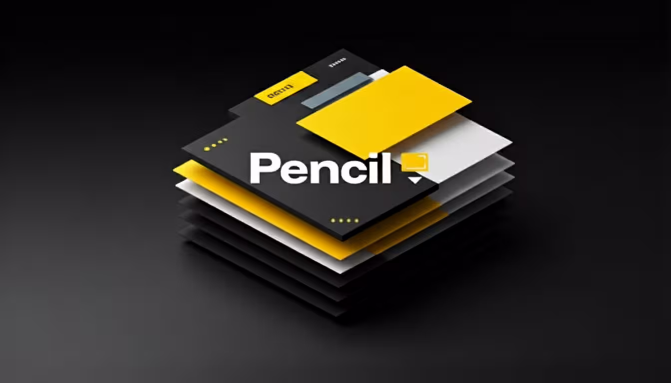
What is Pencil.dev?
Pencil (Pencil.dev) is an AI-native frontend design tool that sits directly inside your IDE (VS Code or Cursor). Unlike traditional design software, it bridges the gap by treating your visual designs as “source of truth” files that live in your Git repository.

It utilises the Model Context Protocol (MCP) to allow AI agents—specifically Claude Code—to read your visual layout and generate pixel-perfect React, HTML, and CSS code instantly.
Note: Do not confuse this with the older open-source “Pencil Project” prototyping tool. Pencil.dev is a completely new, AI-driven platform.
Mastering the Grammar of Vibe Coding
While the shift toward vibe coding allows for a more intuitive creation process, the AI still requires a clear “grammar” to follow. Because the AI generates code based primarily on your visual hierarchy, any ambiguity in your design file will inevitably lead to buggy code.
As we explore in our deep dive into why vibe coding is the future of design, the power of these tools lies in their ability to interpret intent, but that intent must first be signaled through clean design structure.
One of the most effective ways to signal this intent is by grouping relative elements. When an icon and text sit side-by-side, simply grouping them—using a shortcut like Cmd+G in Pencil—signals to the AI that these elements belong together in a flex-row.

Without this explicit grouping, the AI may struggle to understand the relationship between objects, resulting in a fragmented layout.
Similarly, structural stability depends on how you handle containers. Rather than floating a button in the middle of a box and hoping the AI understands the spacing, you should select the box and apply Auto Layout or equivalent alignment constraints.
In the following video, Christopher Deane takes a first look at Pencil.dev.
This ensures the AI generates stable, container-based code rather than relying on absolute positioning that breaks across different screen sizes.
Finally, remember that naming is a form of documentation. Renaming a generic “Frame 42” to something descriptive like pricing-card-container provides the AI with the context it needs to generate semantic class names.
By following these structural habits, you ensure that the “vibe” you design translates perfectly into the code that runs the final product.

Key Features: Why Pencil Changes the Game
1. The Infinite Canvas in Your IDE
Pencil integrates a Figma-like canvas directly into your development environment. Whether you use VS Code or Cursor, you can open a .pen file and start designing without context switching.
- Benefit: No more alt-tabbing between browser design tools and your code editor.
- Tech Spec: The designs are stored as JSON-based
.penfiles, which are lightweight and version-controlled.
2. Seamless Figma Import
For teams entrenched in the Adobe/Figma ecosystem, Pencil offers a “Copy and Paste” workflow that actually works.
- How it works: You can copy a frame from Figma and paste it into Pencil. It preserves layers, auto-layout settings, and styles.
- The Gain: You can do messy exploration in Figma, then move to Pencil when you are ready to “land in code.”
3. Git-Backed Design
This is arguably the most significant innovation. Because .pen files sit in your repository:
- Versioning: You can commit, branch, and merge design changes just like code.
- Sync: If you roll back a commit, your design rolls back too. There is effectively no “drift” between what is designed and what is built.
4. AI & MCP Integration
Pencil acts as a server for the Model Context Protocol (MCP). When you ask Claude Code to “build this component,” it does not just guess; it reads the exact coordinates, tokens, and structure from your Pencil file to generate the React component.
How to Use Pencil.dev: A Step-by-Step Tutorial
Ready to start vibe coding? Here is a practical workflow to build a simple UI component.
Step 1: Installation & Setup
- Install the Extension: Search for “Pencil” in the VS Code or Cursor marketplace.
- Prerequisites: You will need Claude Code installed and authenticated (requires a paid subscription or API credits).
- Activate: Sign up at
pencil.devto get your activation token.
Step 2: Create Your Canvas
- In your project explorer, create a new file named
dashboard.pen. - The Pencil editor will open. You can draw rectangles, add text, or drag in pre-built UI kits (like Shadcn or Lunarus) from the assets panel.

Step 3: Design to Code
- Draft the Vibe: Draw a simple “Sign Up” card. Add an input field, a button, and a header.
- Prompt the AI: Open your AI terminal (Claude Code) and type:”Look at the
dashboard.penfile and generate a React component for the Sign Up card using Tailwind CSS.” - Watch it Build: The AI will analyse the visual structure—noting that the button is inside a container with padding—and write the corresponding
.tsxcode.
Step 4: Iteration
If the padding looks off in the preview:
- Adjust the spacing visually in the Pencil canvas.
- Ask the AI to “Update the code to match the new design.”
- The code regenerates with the corrected values.
The Definitive Guide to Pixel-Perfect AI Design
This guide outlines the specific workflow to achieve “pixel-perfect” fidelity using Pencil.dev. Unlike standard “image-to-code” tools that guess dimensions from a screenshot, Pencil uses the Model Context Protocol (MCP) to feed exact vector coordinates and token values to the AI.
To get professional results, you must treat your Pencil file (.pen) not as a sketch, but as a visual specification.
The following video from World of AI, discusses how this new front-end design tool achieves pixel perfect design.
The Core Principle: Vector-to-Code vs. Image-to-Code
Most AI tools look at a PNG and guess the padding is 20px. Pencil reads the underlying JSON of your design file.
- The Old Way: AI sees a screenshot $\rightarrow$ guesses “approx. 20px padding”.
- The Pencil Way: AI reads the vector node $\rightarrow$ sees
padding-left: 1rem(or16px) $\rightarrow$ writesp-4(Tailwind).
Phase 1: The Setup for Precision
Before you draw a single rectangle, set up the environment to enforce consistency.
1. Install & Configure
- IDE: Use Cursor or VS Code.
- AI Model: Ensure you have Claude 3.7 Sonnet (or the latest available “Code” model) active, as it has the highest spatial reasoning capabilities for MCP.
- Extension: Install the Pencil.dev extension and authenticate.
2. Define Your “Truth” (Tokens)
Pixel perfection fails when the AI guesses colours or spacing. You must prime the AI with your design system.
- Create a
tokens.mdfile in your root directory listing your core values:- Colours: Primary, Secondary, Destructive, Muted.
- Spacing:
1rem = 16px,0.5rem = 8px. - Radius:
sm,md,lg.
- The Prompt Pre-load: When you start a session, tell Claude:”I am using the Pencil MCP. All generated code must strictly adhere to the design tokens defined in
@tokens.md. Do not use arbitrary pixel values (e.g.,13px); snap to the nearest tailwind class.”
Phase 2: The “Pixel Perfect” Workflow
Step 1: The Import (or Draft)
Option A: Import from Figma (Recommended for high fidelity)
- Select your frame in Figma.
- Copy (Cmd+C).
- Paste directly onto the Pencil canvas (
.penfile). - Crucial Step: Check the structure in the Pencil “Layers” panel. If Figma had messy groups, Pencil will have messy groups. Ungroup unnecessary containers and ensure text layers are actual text, not flattened vectors.
Option B: Draw in Pencil
- Use the Frame tool (F) to draw your main container.
- Snap to Grid: Always enable “Snap to Grid” (usually 8px) to prevent fractional pixels (e.g.,
10.43px), which cause blurry rendering in browsers.
Step 2: Structure for “Flex” Logic
The AI writes code based on visual hierarchy. If your visual hierarchy is ambiguous, the code will be buggy.
- Group Relatives: If an icon and text sit next to each other, group them (Cmd+G) in Pencil. This signals to the AI: “This is a flex-row.”
- Padding Containers: Instead of floating a button in the middle of a box, select the box and apply Auto Layout (or equivalent alignment constraints) within Pencil.
- Naming Matters: Rename your layers in Pencil. Rename
Frame 42topricing-card-container. The AI uses these names to generate semantic class names (e.g.,.pricing-card-container).
Step 3: The Generation Prompt
Do not just say “build this.” Use a structured prompt that invokes the MCP precision:
“Inspect the currently selected frame in
dashboard.pen. Generate a React component using Tailwind CSS.Requirements:
- Exact Spacing: Read the exact padding and margin values from the vector nodes.
- Typography: Match the font-weight and line-height exactly as defined in the design.
- Responsiveness: The ‘Hero Container’ layer should be
flex-colon mobile andflex-rowon desktop.- Icons: Replace the vector icons with
lucide-reactcomponents.”
Step 4: The Visual Diff Check
Once the code is generated, render it side-by-side with your .pen file.
- Overlay: A trick pro users use is to take a screenshot of the rendered code, paste it back into Pencil, and set the opacity to 50% over the original design.
- Spot the Drift: Look for text rendering differences (browsers render text slightly differently than vector tools).
- Correction: If the button padding is wrong, do not edit the code manually.
- Correct: Select the button in Pencil $\rightarrow$ Adjust padding $\rightarrow$ Tell Claude “I updated the button spacing in the design file. Update the code to match.”

Phase 3: Handling Responsive “Vibes”
Maintaining visual fidelity across different screen sizes is one of the most common pitfalls in AI-assisted development, as a “pixel perfect” desktop layout often translates into a broken, non-functional experience on mobile.
To master responsiveness within Pencil, you should adopt a multi-frame strategy that establishes a clear visual truth for the AI to follow. By drawing two distinct frames within your .pen file—specifically a mobile frame set to 390px and a desktop frame at 1440px—you can design the exact same component for both states.
This dual-frame approach removes the guesswork, ensuring that the transition between screen sizes is intentional rather than left to the unpredictable interpretation of an algorithm.
Once your frames are established, you can guide the implementation using a precise link prompt that defines the hierarchy of your layouts.
By instructing the tool that the mobile frame represents the default mobile-first state and the desktop frame represents the medium breakpoint state, you can direct the AI to combine these two designs into a single, cohesive responsive Tailwind component.
This specific instruction prevents the AI from hallucinating how a complex element, such as a desktop navbar, should collapse into a mobile menu.
By explicitly showing the visual reality for both states, you maintain total control over the UI while leveraging the speed of automated code generation.
Common Pitfalls & Fixes
| Issue | Cause | Fix |
| “The font size is slightly off.” | Browser vs. Canvas font rendering engines differ. | Use a standard “Type Scale” in your prompt (e.g., “Map visual sizes to standard Tailwind text-sm, text-lg classes”). |
| “The layout breaks on resize.” | You used fixed positioning in the design. | In Pencil, ensure you are using Auto Layout (stacks) rather than absolute positioning. |
| “Colours are wrong.” | RGB vs. HSL mismatches. | Do not let AI guess hex codes. Force it to use CSS variables (bg-primary) defined in your global CSS. |
| “Icons look blurry.” | Imported as PNGs. | Ensure icons are SVGs in Pencil, or instruct AI to replace them with an icon library (Lucide, Heroicons). |
Summary Checklist for the User
- [ ] Clean Inputs: Are your layers named semantically in Pencil?
- [ ] Tokenise: Have you told the AI to prefer your CSS variables over raw hex codes?
- [ ] Grid Snap: Are all your spacing values multiples of 4 or 8?
- [ ] Vector Truth: Are you using Auto Layout in Pencil/Figma to explicitly show the flex relationships?
Pros and Cons for Developers
Integrating design systems directly into the developer workflow offers a transformative shift in productivity, primarily by establishing a “true source of truth” that finally aligns design assets with the Git-centric environment.
By bridging the gap between Figma and the IDE, developers can drastically reduce “translation loss” and ensure that the final implementation mirrors the designer’s original intent without the usual back-and-forth friction.

While the tool remains free during its early access phase in 2026, it is important to note that the experience is currently heavily optimised for Claude Code’s automated developer tools, meaning those committed to alternative LLMs may encounter feature limitations.
Furthermore, while the learning curve is negligible for anyone familiar with modern design interfaces, early adopters should be prepared for minor bugs—particularly when converting complex Auto Layouts—and a slightly smoother desktop experience on macOS and Linux compared to the current Windows iteration.
Pricing and Availability
When considering the financial and technical requirements for integrating this tool into your workflow, the Pencil Tool is currently available at no cost during its early access phase, offering a low-barrier entry for developers keen to experiment with its capabilities.
However, users should account for the underlying AI costs, which typically necessitate a subscription to Claude Code—starting at approximately £15 to £20 per month—or the strategic use of API usage credits for those with more variable workloads.
To ensure a seamless setup, the tool is fully compatible with popular development environments as a VS Code or Cursor extension, and it is also provided as a standalone macOS app for a more dedicated experience.
- Pencil Tool: Currently Free (Early Access).
- AI Costs: Requires a subscription to Claude Code (starting approx. £15-£20/month) or API usage credits.
- Compatibility: Available as a VS Code/Cursor extension and a standalone macOS app.
Conclusion: The Verdict
Pencil.dev is not just another prototyping tool; it is a fundamental shift in how we build software. By making design files readable by machines (via MCP) and trackable by version control (via Git), it validates the concept of vibe coding as a professional workflow.
For freelance developers and small agencies in the UK, this tool offers a massive efficiency boost, allowing a single person to wear both the “designer” and “developer” hats without switching contexts.
Next Steps:
- Download: Visit pencil.dev to grab the extension.
- Learn: Check out the official docs for advanced MCP configuration.
- Experiment: Try converting one small component of your current project to a
.penfile to test the workflow.