Choosing the best website layout is essential to providing a remarkable user experience (UX). As web designers, we are aware that a website’s structure has a significant impact on its usability, appearance, and user engagement. In this article, we examine ten of the best website layouts for 2025, along with examples of websites that successfully use these structures and an explanation of the selection process for each layout.
1. Grid Layout
The grid layout organises content into a structured grid of rows and columns, creating a clean and balanced design. This layout enhances readability and allows for efficient content categorisation, making it ideal for content-rich websites such as blogs and news platforms. For instance, The Verge utilises a grid layout to present articles systematically, facilitating easy navigation and content discovery.
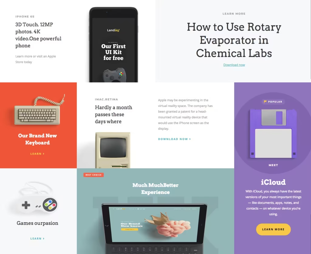
Why Choose a Grid Layout?
As web designers, we opt for grid layouts to:
- Enhance Readability: Structured grids guide the eye, making content consumption more intuitive.
- Ensure Consistency: Uniformity in design elements fosters a cohesive visual experience.
- Facilitate responsiveness: Grids adapt seamlessly to various screen sizes, ensuring a consistent experience across devices.
2. Magazine Layout
Inspired by traditional print magazines, the magazine layout combines text, images, and multimedia elements in a dynamic and engaging manner. This design is perfect for websites aiming to entertain and retain users, offering a visually appealing and organised presentation of diverse content. An example is Elle Magazine, which employs a magazine layout to showcase fashion articles and imagery effectively.
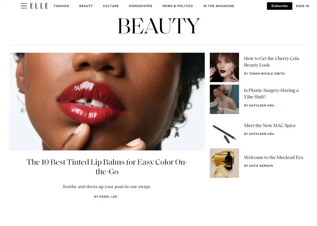
Why Choose a Magazine Layout?
We select magazine layouts to:
- Engage Users Visually: The dynamic arrangement captures attention and encourages exploration.
- Accommodate diverse content: This layout supports a mix of media types, catering to varied user interests.
- Highlight Featured Content: Prominent stories or features can be showcased effectively.
3. Parallax Scrolling Layout
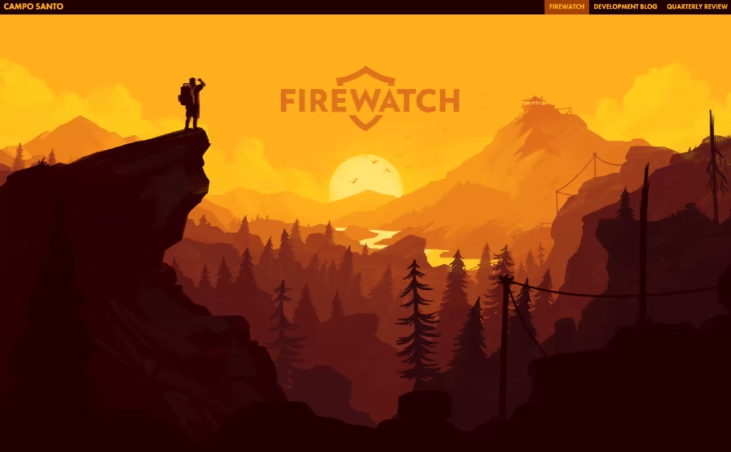
The parallax scrolling layout creates a 3D effect as users scroll, with background images moving slower than foreground content. This interactive experience adds depth and immersion, making it suitable for storytelling and showcasing products or services in a captivating way. For example, Firewatch employs parallax scrolling to enhance its storytelling.
Why Choose a Parallax Scrolling Layout?
We implement parallax scrolling to:
- Create Immersive Experiences: Engaging visuals captivate users, enhancing time spent on site.
- Enhance Storytelling: Sequential content delivery aligns with narrative techniques.
- Differentiate the Brand: Unique interactions set the website apart from competitors.
4. Single Page Layout
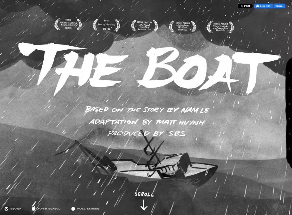
The single-page layout condenses all content into one continuous page, simplifying navigation and enhancing mobile compatibility. This layout is effective for portfolios, product presentations, and event websites, where concise information delivery is essential. An example is The Boat, which tells a story through a single-page design.
Why Choose a Single Page Layout?
We favour single-page layouts to:
- Simplify Navigation: Users can access all information through scrolling, reducing clicks.
- Control Content Flow: Designers can dictate the order in which information is presented.
- Optimise for Mobile: Single pages adapt well to mobile devices, enhancing accessibility.
5. Split Screen Layout
The split screen layout divides the screen into two or more sections, allowing for the simultaneous presentation of distinct content. This design is beneficial for showcasing dual aspects of a product or service, providing users with clear choices and comparative information. For instance, Biospring uses a split screen to differentiate to effectively communicate it’s mission and purpose.

Why Choose a Split Screen Layout?
We choose split screen layouts to:
- Present Dual Options: Clearly display two primary actions or pieces of content.
- Enhance Visual Appeal: Symmetry and balance create an aesthetically pleasing interface.
- Improve User Decisions: Simplifies choices by presenting options side by side.
6. Asymmetrical Layout
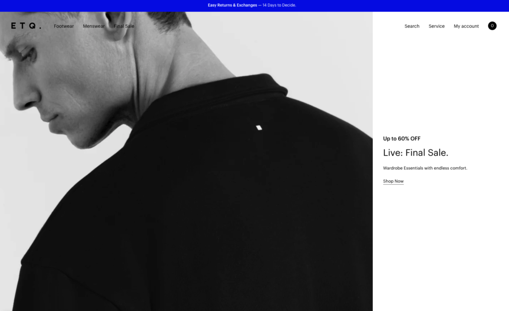
Breaking away from traditional symmetry, the asymmetrical layout uses intentional imbalance to create a dynamic and intriguing visual experience. This layout captures attention and can effectively highlight specific content, making it popular among creative agencies and modern brands. An example is ETQ, which uses an asymmetrical layout to showcase its products.
Why Choose an Asymmetrical Layout?
We employ asymmetrical layouts to:
- Create Visual Interest: Unexpected arrangements engage users and encourage exploration.
- Highlight Key Elements: Draw attention to specific content or calls to action.
- Convey Modernity: Reflects contemporary design trends, appealing to forward-thinking audiences.
7. Card-Based Layout
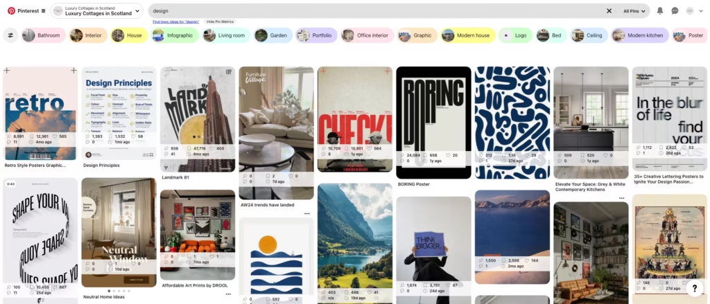
The card-based layout presents content in individual cards, each containing a concise piece of information. This modular approach enhances scannability and is highly responsive, adapting well to various screen sizes. It’s commonly used in dashboards and content-heavy platforms. For example, Pinterest uses a card-based layout to display pins.
Why Choose a Card-Based Layout?
We opt for card-based layouts to:
- Enhance Organization: Modular design simplifies complex information.
- Improve Responsiveness: Cards rearrange easily for different screen sizes.
- Facilitate User Interaction: Interactive cards can link to detailed content, improving engagement.
8. Full-Screen Image Layout
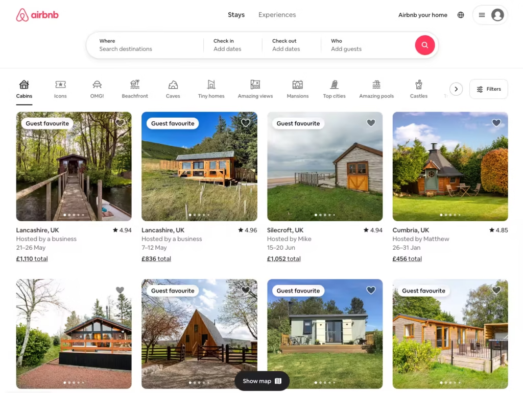
Utilising high-resolution images that cover the entire screen, the full-screen image layout creates an immediate visual impact. This design is ideal for portfolios and websites aiming to evoke strong emotions, relying on compelling visuals to engage users. An example is Airbnb, which uses full-screen images to showcase destinations.
Why Choose a Full-Screen Image Layout?
We select full-screen image layouts to:
- Captivate Users Immediately: Striking visuals create a memorable first impression.
9. Minimalist Symmetrical Layout
The minimalist symmetrical layout focuses on clean lines, ample white space, and essential information, creating a relaxing and intuitive user experience. Websites like The Inverness Design Studio exemplify this design by presenting content in a straightforward manner with a solid background and organised sections. As web designers, we opt for this layout to emphasise content without distractions, ensuring that users can navigate the site effortlessly. This approach is particularly effective for personal portfolios and businesses aiming for a professional and uncluttered online presence.
10. Creative Angled/3D Layout
Pushing design boundaries, the creative angled or 3D layout incorporates unconventional shapes and dimensions to break traditional two-dimensional constraints while maintaining readability. For example, the website Zero utilises a screen-sized animation with unique layouts to engage users. As web designers, we choose this layout to create a memorable visual impact, making the website stand out. This design is suitable for brands looking to showcase innovation and creativity, particularly in industries like technology and design.
You can read more about how to create 3D web design in this step-by-step guide.
