Have you ever gone to a website and been immediately engrossed? It’s not a coincidence. Technology, psychology, and art are all combined to create an engaging website that keeps visitors on it. I’ve researched what makes pages memorable as a designer and SEO specialist. Let’s analyse it collectively.
What Makes a Web Page Truly Engaging?
Before users ever read a word, engagement begins. It concerns:
- Visual hierarchy guiding the eye effortlessly.
- Scannable content with bite-sized paragraphs.
- Intuitive navigation that feels like second nature.
- Emotional resonance—through colour, imagery, and micro-interactions.
In 2025, people’s attention spans are shorter than ever. Visitors have three seconds to convince them that you are valuable. Start “above the fold” with an attention-grabbing headline, a powerful statement of values, and a clear call to action.
The attention span of a web site is limited to a few seconds. Creating an experience that is intuitive, immersive, and emotionally impactful right away is far more crucial for engagement than just employing innovative advertising or eye-catching visuals.
The Foundations of Engagement
Visual Hierarchy That Guides Effortlessly
A strong visual hierarchy is the foundation of an engaging webpage. By using size, colour, contrast, and whitespace to organise elements according to their relevance, designers may naturally direct the user’s attention to the most crucial content. For example, a large, catchy title above the fold and a clear call to action immediately alert visitors to the most crucial information and the next steps. The effective use of alignment, repetition, and proximity further elucidates the relationships between things, making the page easy to read and comprehend.
People scan before they read these days. Text is easy to read when it has bullet points, short paragraphs, and clear subheadings. By taking into account users’ short attention spans and mobile browsing habits, this layout ensures that crucial messages are quickly comprehended even if users just spend a few seconds on the website.
Intuitive Navigation: Simplicity Wins
It ought to be easy to use. By removing extraneous components and focussing on the essentials, minimalist navigation—the trend for 2025—makes it simpler for consumers to find what they need. By keeping important connections close to hand, dynamic mega menus and sticky navigation bars enhance usability and reduce aggravation.
Emotional Resonance Through Colour, Imagery, and Micro-Interactions
Emotionally engaging websites use colour psychology, evocative imagery, and tiny micro-interactions (such hover effects or animated buttons) to create a memorable experience. These elements encourage individuals to interact with the brand more, set the tone, and uphold its identity.
“If you have a hard time figuring out where to look on a page, it’s more than likely that its layout is missing a clear visual hierarchy.”
— Nielsen Norman Group
Emerging Trends Driving Engagement in 2025
Interactive Content Takes Centre Stage
These days, engagement is fuelled by interactive films, surveys, and tests. In addition to offering entertainment, these layouts promote user interaction, which lengthens visitor stays and boosts conversion rates. Augmented reality (AR) experiences, such as virtual try-ons or immersive product displays, bridge the gap between online and offline by giving the impression that digital interactions are real and personal.
Immersive Storytelling and Scrollytelling
Websites are increasingly using scrollytelling, where stories and animations play out as users scroll, to make browsing an interactive experience. This tactic maintains customer attention by transforming passive viewing into active investigation.
Personalisation Powered by AI
AI-powered real-time content and suggestion personalisation makes each visit appear especially relevant. Chatbots, dynamic product recommendations, and adaptive layouts all contribute to a more engaging, user-centred experience.
Gamification and 3D Visuals
Gamified experiences and 3D elements increase engagement by making interactions fun and rewarding. Users are more likely to stay and explore when they can manipulate objects, earn awards, or move through dynamic, visually rich environments.
Sustainability and Accessibility
Modern consumers appreciate brands that care about their internet presence. Websites that load fast and effectively are accessible to all customers, which improves user engagement and builds brand recognition.
Above the Fold: The First 3 Seconds Matter
You only have three seconds to persuade a guest to stay in 2025. Above the fold, the following should be present:
- A bold, benefit-driven headline
- A clear, concise value proposition
- A prominent call to action
- Striking visuals or interactive elements that immediately convey your brand’s personality
A truly fascinating homepage in 2025 is made up of more than just clever writing and eye-catching imagery. This thoughtfully designed experience guides, delights, and connects people from the very beginning. By integrating emotive design, scannable content, visual hierarchy, simple navigation, and cutting-edge interaction, brands can create digital spaces that inspire action and loyalty.
How Do You Structure a High-Performing Web Page?
Think of your page as a conversation. The following elements make for an effective homepage design:
1. Header: First Impressions Count
Your header sets the tone for the entire site. Keep it clean and functional:
- Logo: Instantly communicates your brand identity.
- Minimalist Menu: Limit navigation to essential links for clarity and focus (Nielsen Norman Group).
- Contact CTA: A visible, action-oriented button (e.g., “Book a Call” or “Get a Quote”) encourages immediate engagement.
- Problem/Solution Statement: Address your audience’s pain point and how you solve it.
- Primary CTA: A bold button (e.g., “Start Free Trial”) invites action.
“Above the fold content should answer the visitor’s most pressing question: ‘What’s in it for me?’”
— HubSpot
2. Social Proof: Build Trust Instantly
Showcase client logos, partner seals, or trust badges to establish credibility fast.Showcase client logos, partner seals, or trust badges to establish credibility fast.
3. Multimedia Zone: Show, Don’t Just Tell
A quick video example or interactive graphic can improve understanding and engagement. It has been demonstrated that video increases conversion rates and time on page.
4. Testimonials: Real Faces, Real Stories
Actual testimonies with pictures of the clients Build trust and make your brand more relatable. Face-based social proof is much more convincing than just words.
5. Footer: The Safety Net
Provide resources, secondary CTAs (newsletter signup, help links), and legal links (privacy policy, conditions). Even at the end of the journey, a well-organised footer aids consumers in finding what they need.
Pro Tip: Map Before You Build
Before coding, use tools like Figma or Adobe XD to wireframe your homepage. This saves development time and money by enabling you to test layouts, visualise the user experience, and iterate rapidly.
Why Does Visual Hierarchy Rule Engagement?
Invisible signposts are produced by the font, colour scheme, and spacing of your website. For instance:
- Readable web fonts like Inter or Plus Jakarta Sans (size 16px+).
- Contrast colours for CTAs (e.g., coral against slate).
- Whitespace to let elements “breathe.”
Brand-led website design will be the most popular in 2025. The personality of your brand should be whispered by every colour, shape, and font weight.
Visual hierarchy is, in fact, the silent conductor of user involvement. When brand-led website design takes centre stage in 2025, the strategic use of typeface, colour, and space isn’t just about aesthetics; it’s also about making it easier for visitors to navigate your digital story.
Invisible Signposts That Guide the Eye
Visual hierarchy is the technique of arranging and embellishing objects so that people naturally know what to glance at first, next, and last. This is achieved by:
- Typography: Readable, modern web fonts like Inter or Plus Jakarta Sans (set at 16px or larger) ensure your message is accessible and inviting. Larger, bolder headings draw the eye, while smaller body text supports easy scanning (Smashing Magazine).
- Colour Palette: High-contrast colours make calls to action (CTAs) pop. For instance, a coral button on a slate background grabs attention and signals where to click—critical for conversions (Nielsen Norman Group).
- Whitespace: Generous spacing around elements gives your content room to breathe. This not only improves readability but also adds a sense of sophistication and calm, keeping users engaged rather than overwhelmed.
Brand-Led Design: Every Detail Matters
In 2025, every visual choice you make should reflect the core of your company. Consistent use of font weights, colours, and curves improves trust and brand recognition. These small touches, like the whimsical roundness of your buttons or the authoritative weight of your headlines, evoke strong feelings in users and encourage them to return.
“Visual hierarchy isn’t just about what looks good—it’s about what feels right for your brand and your users.”
— Adobe XD Ideas
Why It Matters More Than Ever
Customers make snap decisions on whether to stay or go because their attention spans are shorter than before. A solid visual hierarchy encourages engagement, conversions, and brand loyalty by making sure your most important messages are seen first.
By 2025, digital engagement will be based on visual hierarchy. By carefully combining typeface, colour, and space, you may create invisible signposts that guide, delight, and convert. You will see a rise in engagement if you allow your design choices to reflect the voice of your brand in a world where every pixel counts.
How Can Multimedia Elements Boost Engagement?
Snoozefests are static pages. Include these in your approach for web site content:
| Element | Use Case | Implementation Tip |
|---|---|---|
| Embedded Video | Explainer reels, testimonials | Use YouTube embeds as backgrounds (with opacity filters for text readability). |
| 3D Models | Product showcases, immersive storytelling | Spline or Three.js—add subtle mouse-tracking effects. |
| Interactive Diagrams | Data viz, process flows | Create with Napkin AI—embed with clickable hotspots. |
| GSAP Animations | Scroll-triggered reveals, hover effects | Animate stats counters or image zooms for polish. |
Word of Caution: Strike a balance between quickness and attractiveness. Website performance optimisation might be destroyed by heavy 3D elements. Lazy-load, always!
Multimedia elements will transform static webpages into dynamic, memorable experiences that captivate users and yield results, revolutionising online engagement in 2025.
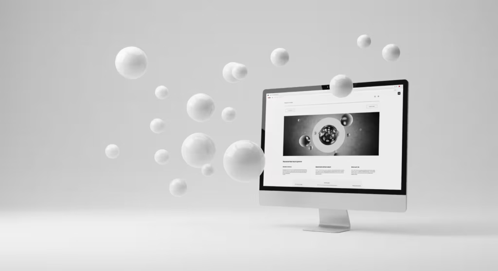
How Multimedia Elements Boost Engagement
1. Video Content: The Engagement Powerhouse
- Video is the most effective medium for narrative, product demonstrations, and testimonials. By 2025, 82% of all consumer internet traffic is predicted to consist of videos, and 89% of consumers want businesses to create more videos.
- Customers’ average time on your website can be increased by up to 88% and conversion rates can be greatly increased by adding customer testimonials or explanation reels (using YouTube embeds with opacity filters for text readability).
- Pro tip: Use clear titles and captions for your videos to improve accessibility and SEO.
2. 3D Models and Immersive Storytelling
- Users are engaged by interactive storytelling and 3D product presentations that employ technologies like Spline or Three.js to make complex things tangible and memorable.
- Bridging the gap between online and offline with augmented reality experiences or subtle mouse-tracking effects increases conversions and brand memory.
3. Interactive Diagrams and Data Visualisation
- Interactive graphs and clickable hotspots (created with tools like Napkin AI) turn data or process flows into engaging, educational journeys.
- These elements can boost dwell time and knowledge retention by up to 65% by promoting user involvement.
4. GSAP Animations and Micro-Interactions
- Hovering or scrolling (with GSAP) can start animations that highlight statistics or images, draw attention to them, and give them a polished look.
- These micro-interactions foster a sense of joy and promote deeper study.
The Science Behind Engagement
- Watching a video helps people remember 95% of a message, whereas reading text only helps them remember 10%. People also see visual content 94% more often than text-only content.
- Interactive content, such as games, polls, and quizzes, can transform passive viewers into active participants, boosting SEO performance, click-through rates, and dwell times.
Balance Beauty and Speed
Despite the fact that multimedia boosts user interest, huge assets may slow down the loading speed of your website. Always:
- Optimise file sizes and use lazy-loading for videos and 3D models.
- Prioritise mobile responsiveness, as over 55% of traffic is mobile.
“Interactive content is no longer a trend but a necessity for engaging and converting audiences in 2025.”
— 123 Internet Agency
In summary: Multimedia elements improve your website’s conversion rate and make it more memorable and interesting when used correctly. Finding a balance between performance and rich experiences is the key to making your website consistently fast, user-friendly, and entertaining for all visitors.
What’s the Role of Interactivity in Modern Layouts?
Beautiful interactions aren’t just decorative—they reward curiosity. Try:
- Sticky navigation bars that shrink on scroll.
- Preloaders with brand motifs (e.g., a bouncing logo).
- Micro-interactions: Button ripples, hover card flips.
Using GSAP or Framer Motion? Keep animations under 300ms. Smooth, not sluggish.
Passive surfing is made enjoyable and rewarding by the interactivity that powers modern internet design. By 2025, a website should appear dynamic, adaptable, and user-friendly, holding visitors’ attention throughout. Being aesthetically pleasing is no longer sufficient.
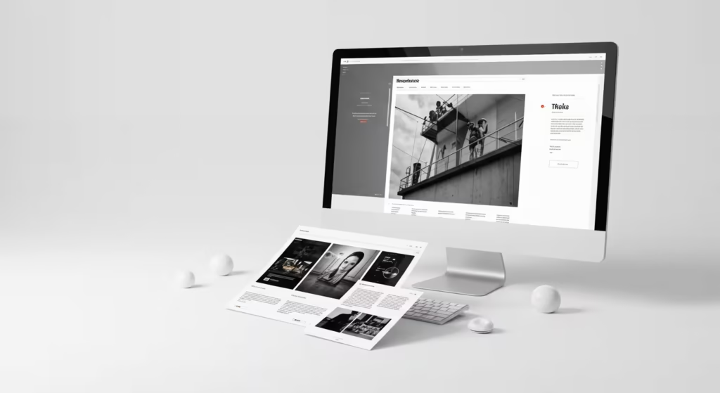
1. Guiding and Rewarding User Exploration
More than just adding style, interactive components offer feedback, direct navigation, and tailor the user experience. For instance:
- Sticky Navigation Bars: These remain visible as users scroll, often shrinking or subtly transforming to maximise screen space. This keeps essential links always accessible, improving usability and reducing frustration.
- Preloaders with Brand Motifs: Instead of a generic spinner, preloaders featuring your logo or a playful animation set the tone and reinforce brand identity while content loads, turning wait time into a branding opportunity.
- Micro-Interactions: Small effects—like button ripples, hover card flips, or animated icons—reward user actions, making the interface feel tactile and responsive. These details create moments of delight that encourage further exploration.
2. Enhancing Usability and Engagement
Well-designed interactions make it easier for users to grasp what may be clicked, what is loading, and what comes next. The site seems quicker and more user-friendly thanks to seamless transitions and feedback that lessen cognitive burden. Tools like GSAP and Framer Motion enable designers to create animations that are both performant and visually pleasing.
3. Building Brand Personality
One of the most effective ways to convey the personality of your business is through interaction. Whether it’s a clever menu reveal or a funny preloader, these details distinguish your website from the competition and make it memorable.
“Micro-interactions are the secret sauce of digital products, turning mundane moments into memorable experiences.”
— UX Planet
4. Balancing Performance and Delight
Although interaction increases participation, performance should never be sacrificed. Always:
- Optimise animations for smoothness and speed.
- Lazy-load non-essential scripts.
- Test on mobile and low-powered devices.
Interactivity is more than simply ornamentation in contemporary online design; it is crucial for usability, engagement, and brand narrative. A digital experience that seems alive, natural, and memorable may be produced by carefully incorporating interactive features while maintaining speed and purpose.
Pro Tip:
Keep animations under 300ms. Research shows that transitions in this range feel instant and natural, while longer delays can make a site feel sluggish (UX Collective).
Key Takeaways
- Hook instantly with above-the-fold content.
- Guide users with visual hierarchy and scannable content.
- Enrich with video, 3D, or interactive diagrams—but optimise relentlessly.
- Animate thoughtfully (GSAP is your friend).
- Test mobile-friendliness and page speed weekly.
- Write persuasive web copy—clear, benefit-driven, and concise.
Engagement isn’t luck. It’s anatomy. Nail the bones, then make it dance.
Ready to audit your site? Start with Google’s PageSpeed Insights—it’s brutally honest.
If you’re serious about building authority and boosting your site’s Domain Authority (DA), don’t overlook the value of quality listings.
Take a minute to check out our Free Listing Database
— a completely free, ad-free directory designed to help you grow your backlink profile and accelerate organic growth with zero cost or fuss.
