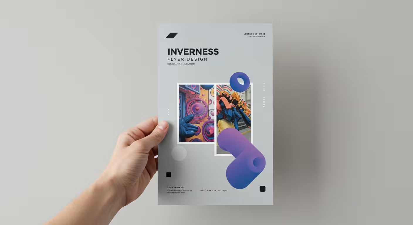
So you need to create a flyer. Perhaps it’s for a neighbourhood gig, a community event, or the autumn advertising of your small business. Perhaps your initial thought is, “Aren’t flyers a little… outdated?” The fact is that a well-designed physical flyer can stand out from the crowd and seem more genuine and authoritative than another internet advertisement in our digitally dominated society.
The good news is that you can still produce something amazing without being an expert in marketing or graphic design. From the initial concept to the finished printed result, this beginner’s guide to flyer design will take you step-by-step through the entire process.
Why are flyers still effective for marketing?
Flyers are an inexpensive yet effective way to promote a new product, advertise your business, or publicise an event. They enable you to physically reach your audience—just picture distributing fliers for a new store selling running gear at a nearby marathon. When individuals are most open to your message, you are reaching them.
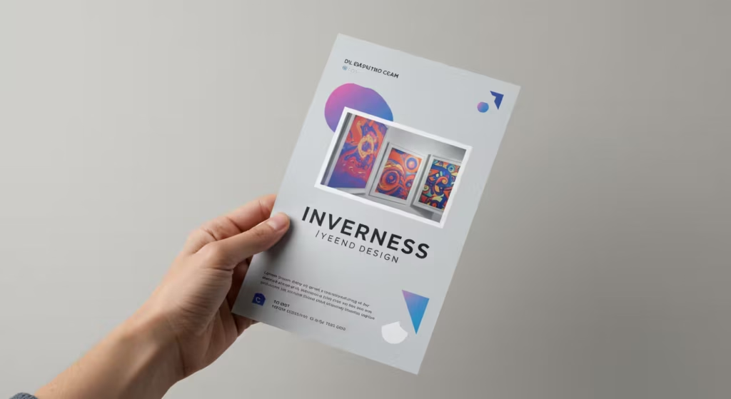
Sometimes a short-lived social media post can’t establish credibility and trust as well as a physical piece of paper.
What are the essential elements of a successful flyer?
Before you even open a design program, you need to know what to put on the page. Every effective flyer is built on a few key components. Think of it as answering the 5 W’s: who, what, when, where, and why.
- An attention-grabbing headline: This is what readers will see initially. It must be juicy and immediately catch their eye. Pose a query such as “Want to Reduce Your Winter Energy Costs?” Use a strong, straightforward term like “Free!” or “Sale!” instead.
- Strong visuals: A picture speaks a thousand words. Make use of an eye-catching, pertinent image or graphic that highlights your point and draws attention.
- A concise, unambiguous message: Don’t attempt to speak all at once. Give each flyer a single, important message. Is it the event for the launch? The twenty percent off? The new line of products? Pick one.
- Every detail that is required: Indicate the important details in clear terms, such as the date, time, place, website, or phone number. Make it simple for people to understand their next steps.
- A call-to-action (CTA) is a clear statement of what you want people to do. “Check out our website,” “Get your complimentary beverage,” or “Scan the QR code”
What are the key design principles for an eye-catching flyer?
The exciting part is here: the design. Many novices feel overwhelmed at this point, but following a few basic guidelines will help. Creating a visual hierarchy that directs the reader’s eye through the material in order of significance is the aim of your flyer layout.
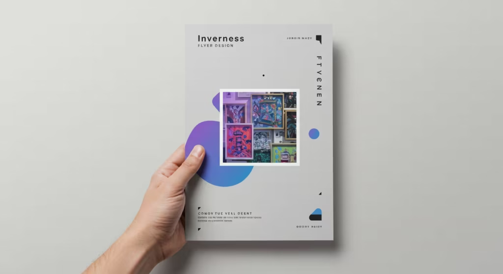
1. Create a focal point and balance
What is the most crucial element on your flyer? Make that the main attraction. To make it stand out, use placement, colour, or size. Make sure your design is balanced after that. Avoid packing every available space with words and pictures. Utilise white space, or empty space, to highlight the existing pieces and provide the design breathing room.
2. Choose fonts and colours wisely
The tone is established by the typefaces and colour palette you select. Use classic, clean fonts for a polished business flyer. You can try something more ornamental for a creative event. Readability and personality alignment with your brand are crucial. To increase recognition and maintain consistency in your marketing, use your brand’s colours.
3. Use icons and graphics
An excellent tool for novice flyer design is an icon. They may break up text-heavy material and are easy to recognise, making it easier to scan your flyer. They can be used to make basic graphics, highlight contact information, or represent services.
What are the most common flyer design mistakes beginners make?
Steering clear of these common errors will instantly make your flyer look more professional.
- Trying to cram too much information onto a page is the worst mistake. A cluttered flyer is unfriendly and confused. Don’t complicate things.
- Images of poor quality: A grainy or pixelated photo can give the impression that your entire company is not professional. Use high-resolution photos at all times.
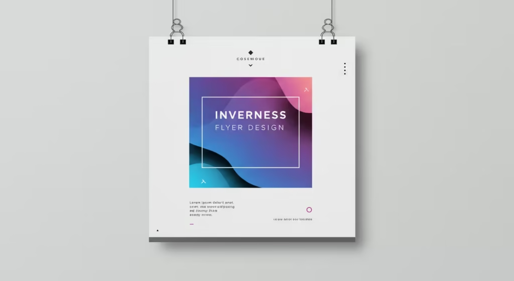
- Unclear call-to-action: If people don’t know what you want them to do, they won’t do it. Your CTA must be obvious.
- Ignoring the basics: It sounds simple, but always proofread your flyer. A typo in the date or web address can ruin your efforts.
A comparison of easy-to-use flyer design tools for beginners.
Expensive, complex design software is not necessary. Flyer design is now accessible to anyone thanks to amazing online tools. Some of the top choices for do-it-yourself flyer design are contrasted in the table below.
| Feature | Canva | Adobe Express | Microsoft Office |
|---|---|---|---|
| Ease of Use | Extremely user-friendly with a simple drag-and-drop interface, ideal for absolute beginners. | User-friendly platform with powerful features, suitable for those wanting a bit more creative control. | Familiar interface for existing Office users, though design flexibility can be more limited. |
| Template Library | Huge library of over 1 million professionally-designed, free flyer templates. | Thousands of professionally-designed templates across various styles. | A wide selection of free, customizable flyer templates within Word and other 365 apps. |
| Key Features | Massive free media library, real-time collaboration, and integrated printing service. | AI-powered design tools (Magic Studio), ability to import PSD/AI files, and brand consistency features. | Deep integration with the Microsoft 365 ecosystem, easy to use for basic text-heavy flyers. |
| Best For | Beginners and small businesses looking for the quickest, easiest way to create a professional-looking flyer. | Users who want to leverage AI or have some basic design experience and want advanced features. | Those who primarily work within the Microsoft environment and need to create simple flyers quickly. |
Your step-by-step guide to flyer creation.
All set to create your flyer? Use this easy, step-by-step instruction to create flyers.
- Choose your tool: Based on the comparison above, select the platform that feels right for you. For most beginners, we recommend starting with Canva.
- Select a template: Don’t start from a blank page. Browse the template library and pick a design that fits your purpose. You can filter by theme, industry, or style.
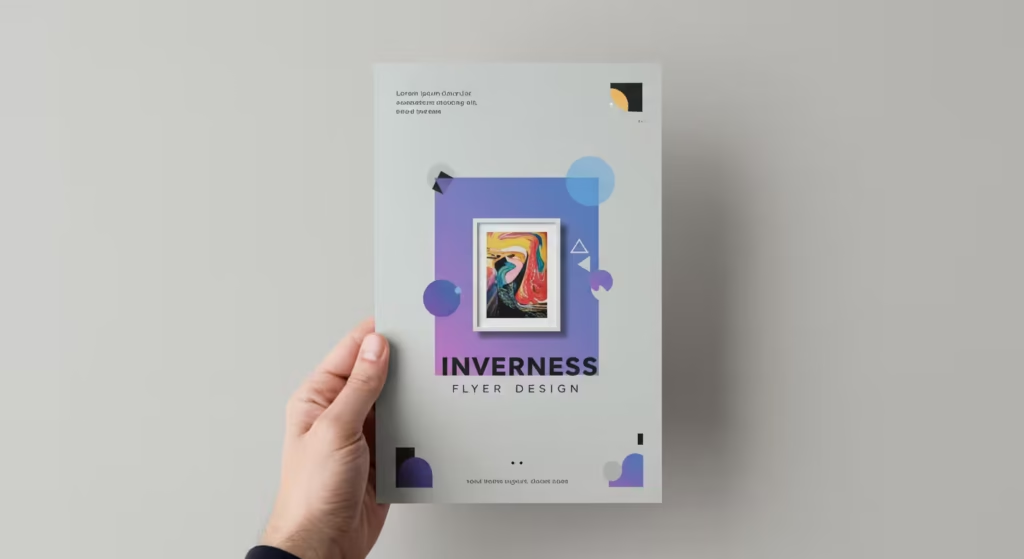
- Personalise everything: This is your chance to add your own touch. Modify the text to convey your point. Replace the pictures with either expert stock photos or your own excellent photographs. Modify the fonts and colours to reflect your brand.
- Use the following guidelines: Recall the hierarchy of visuals. Is your headline the most important component? Is the call to action obvious? Take a step back and check to see if the layout is clear and balanced.
- Review and print: Carefully proofread everything. After that, you can post your design straight on social media or download it as a PDF for expert printing. Numerous websites, such as Canva Print, also provide reasonably priced, excellent printing services that will produce final prints.
A final checklist before you print.
Make sure you haven’t forgotten anything by going over this brief list before approving your flyer design.
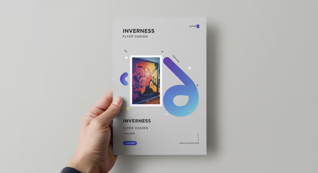
- Does it have a strong, attention-grabbing headline?
- Is the core message immediately clear?
- Are all the key details included (date, time, place, contact info)?
- Is there a clear call-to-action?
- Are the images high quality?
- Is the text easy to read?
- Have you proofread for spelling and grammar mistakes?
10 creative flyer ideas to spark your inspiration.
If you’re still looking for that spark of genius, here are ten quick flyer ideas to get your creative juices flowing for your next autumn campaign.
- The Minimalist: Use lots of white space, a single striking image, and clean typography for a sophisticated look.
- The Bold Type: Make your headline the star by using an oversized, bold font that dominates the page.
- Photo Background: Use a full-bleed, high-quality photo as the background with a semi-transparent shape overlay to make text readable.
- Illustrative Charm: Use custom illustrations or curated icons to give your flyer a unique, personal feel.
- The Incentive: Feature a prominent discount code, QR code, or special offer to encourage immediate action.
- Vibrant Colours: Use a bold, vibrant colour scheme that stands out on a noticeboard or through a window.
- Infographic Style: Use icons, charts, and diagrams to present information in an easily digestible way.
- Collage Effect: Combine multiple images in a dynamic collage layout to tell a story or showcase a range of products.
- Brand Consistency: Design your flyer using only your strict brand colours, fonts, and logo for instant recognition.
- The Personal Touch: For a local business, consider including a photo of yourself or your team to build a connection with your community.
Flyer design doesn’t have to be difficult. You may make a promotional flyer that actually works if you have the correct resources and follow these basic guidelines. Select a template, begin personalising it, and spread the word.
Mastering the art of print design requires more than just reading about it; it requires active experimentation. The Free Design Sandbox provides the perfect environment to apply these principles in real-time.
By engaging with interactive challenges focused on balance, hierarchy, and color theory, you can see exactly how small adjustments impact the effectiveness of a flyer or illustration. It’s an invaluable, risk-free space for aspiring visual artists to refine their skills and gain the confidence needed to create professional-grade layouts for print.
